• 02188506022
  • info@dirgodaz.com
  • 08:00-16:00

Juxtaposition of colors

Juxtaposition Of Colors

Have you been confused with the choice of color in various interior design styles?

In our opinion, the interior design or adornment of an ideal home or relaxing work environment is not only hard, but also fun and entertaining. If you do not have enough time and money to recall professional designers, this is the best solution for you, and it helps you design arbitrary space with various materials and interior design, especially refractory bricks. . Application of this method will be very easy. You can choose any color and design you like. The only way is to choose the depth, tonality, and color that’s exactly what you want.

To achieve excellent results, it’s only necessary to run our step-by-step guide:

1- Take a look at what you have.

2- Start by writing the following articles

  • The room qualities, for example, are large or small, dim or light.
  • Your favorite colors are up to three colors
    When you are working on a satisfactory color combination, you need to consider the effect of light exposure on the environment. For example, brilliant yellow walls in a sunbathing environment look very nice, but the same color on the walls that use light natural light is a lot of boredom. In such an environment, it is better to use a yellowish mustard. Light depending on whether it is natural or artificial, will have different effects on the color, and awareness of this is vital when designing the color of a space. Be careful when and how much daylight to each of your rooms and the color you want for each room in the same lighting conditions.

Color selection juxtaposition of colors

  • Choosing the right color for covering the walls and then the texture and color of the refractory brick is the first step in color design for interior design of a room, but it may be a little more difficult to find the appropriate colors between the two and also for other decorative components.
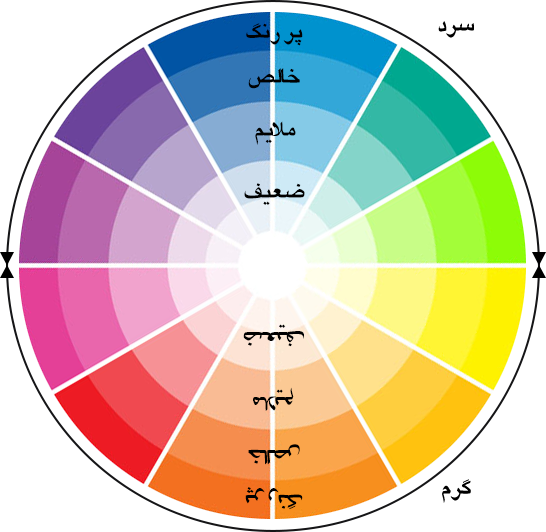
    Using the color cycle is a surefire way to find the colors that fit our color. The color cycle consists of twelve colors, the three colors of which are red, blue and yellow, as the primary colors and colors, among which are known as secondary colors. Each color in this cycle can be well combined with the colors of its side, which are the colors of its family, as well as the color of the opposite, which is the color of its complement, and with precise harmony, give a beautiful and balanced result. Using the colors of the family that surrounds the color wheel and the so-called neighbor, creates a gentle and harmonious combination that guides the viewer easily from one to another.
    Due to the fact that all refractory bricks make two beautifully rendered designs, due to the nature of the color scheme in refractory bricks, all bricks used in harmonious colors, which in the color cycle are ultimately at a 90 degree angle to each other, is. You can safely use these colors together in the interior design of your space and ensure the result of your work.
    Using a color with a small amount of its complementary color, if properly and in correct measure, gives a brilliant and impressive result and adds to the attractiveness of the existing color scheme and prevents the full dominance of a color on the room space.
  • Using a color with a small amount of its complementary color, if properly and in correct measure, gives a brilliant and impressive result and adds to the attractiveness of the existing color scheme and prevents the full dominance of a color on the room space.
  • Your favorite items in the room. These tools help you decide how to lay out. The general recommendation is to try to put one or two small devices in opposite colors in a series of matching colors in the fireproof brick wall as a background. In this way, give a pleasant look to your living space.

3-Get your interest list. Think about how you want the room to look

Warmer: Start from the warm colors of the colored circle
Cooler: Start with cool colored circles of colors
Bigger: Choose weak or gentle tonalities
Smaller: Select tall or pure tonalities.
The two cool and cool color groups are completely different from the effects they have on the viewer, and no doubt their use depends on your mood or the space you want to create. In general, keep in mind that warm colors, like red, are somehow close to the viewer as if they are moving toward you. In contrast, cool colors like blue, distances, and distances are in the mind. As a result, warm colors are not suitable for closed and small spaces, and these spaces are smaller, but cool colors show the environment bigger.
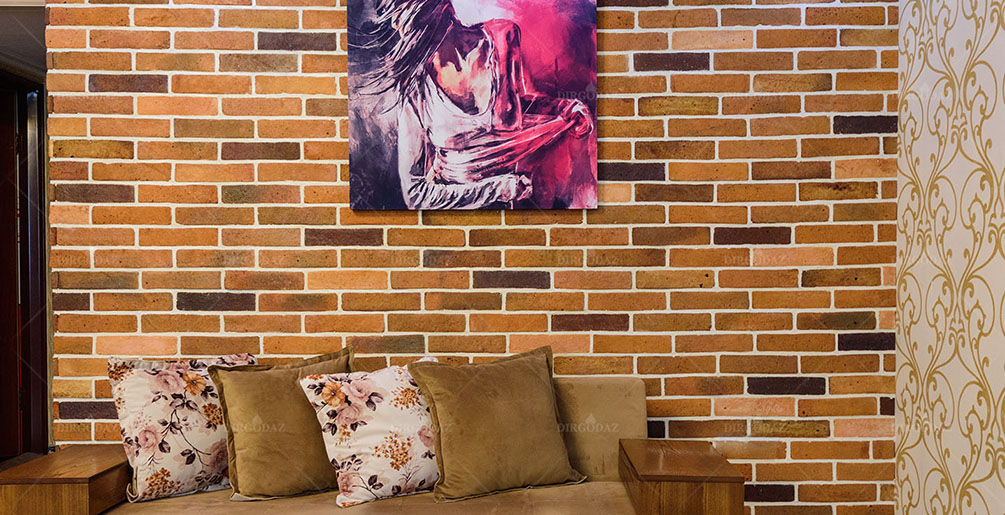
On the other hand, the use of warm and cool colors creates a lot of attraction. For example, placing a violet and violet paint on a wall of light yellow fire-resistant bricks will exacerbate the appearance of both colors. Putting a decorative blue element in front of the red wall will also slow down the color of the red color.

4- Make your own complete plan.

  • Find the colors you want, decide on the correct tonalities that you want. Use the circle of colors and find the correct tonalities. Use this guide to choose the colors and flooring for your room as the base for your new design.
  • Add the furniture and accessories to your favorite designs. See the chart below for new ideas.